
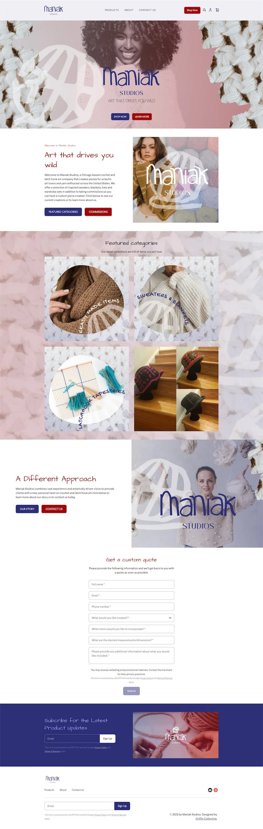
14 Stunning Square Website Examples to Inspire You
Square has grown from just a point-of-sale tool into a website builder that covers all the essentials. It connects smoothly with features you already need, like online ordering and Square Appointments.
Now, here’s something to keep in mind. If you want heavy animations, hover effects, or custom code, Square is not the place for that. The same goes for blogging, at least for now. In those cases, Squarespace is often the better fit.
One tip I share with every client is to focus on mobile first. If a photo looks beautiful on desktop but cuts off on mobile, adjust the section layout until it fits. Most of your customers are visiting your site on their phone, so that is where it really needs to shine.
No matter if you are running a salon, a retail shop, or a professional service, your website should make it easy for people to take the next step. For salons, that means booking. For retailers, it is buying. For service providers, it might be requesting a quote or scheduling an appointment.
In the end, it all comes down to one clear call to action that shows up again and again across your site.
To give you a clear picture of what that looks like, I pulled together 13 stunning Square website examples across different industries. Each one keeps the main call to action front and center. Use these as inspiration for your own site.
Best Square Website Examples
Beauty and Wellness
Beauty and wellness websites shine when booking is front and center. A clean design paired with strong photos helps clients feel confident before they ever step through the door.
1. Cadre Salon

The hero image takes the win here. It sets the entire mood of the site in a single glance. The design is bold without being overwhelming and it makes you want to step into the salon right away.
2. Bladecraft Permanent Makeup
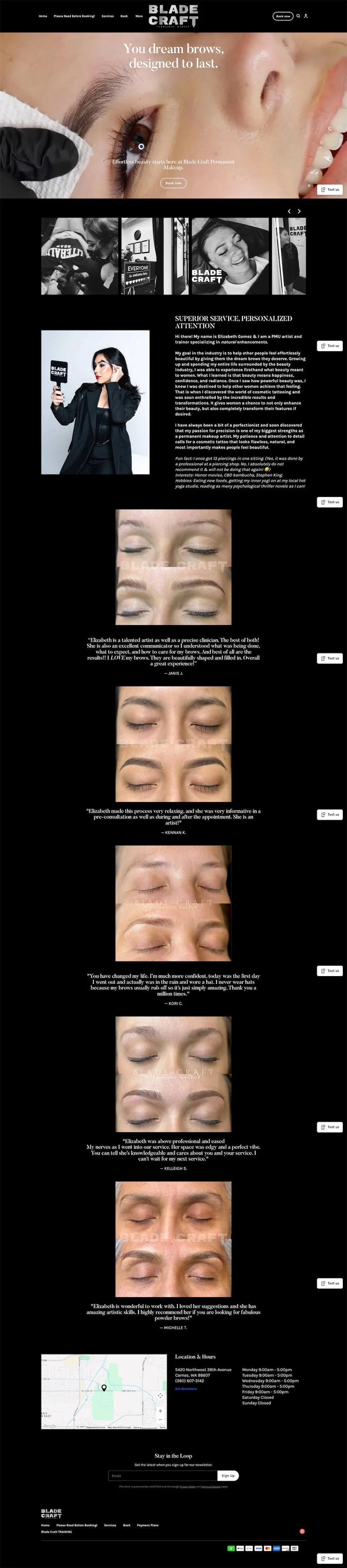
This is one of those sites that makes you stop scrolling. The video background draws you in immediately and it looks amazing on mobile. Paired with before and after photos that show dramatic transformations, the site gives clients confidence before they ever book.
3. My Nest Salon
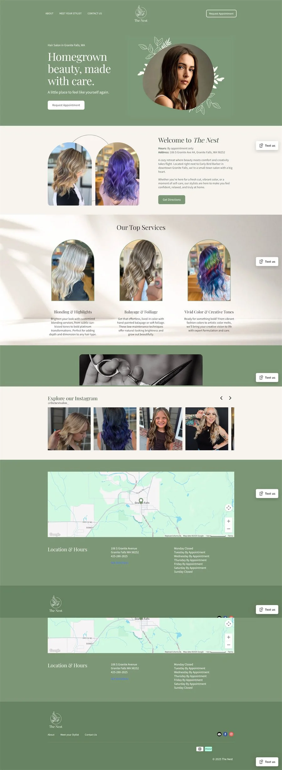
The branding here is warm and welcoming. The colors are soft, the layout feels clean, and booking is always easy to find. It is the kind of site that instantly makes you trust the quality of service.
Food and Beverage
Food and beverage sites work best when they balance atmosphere with practicality. Customers want to see the vibe, check the menu, and place an order or reservation quickly.
4. The Daddy Burger

This restaurant site is bold, fun, and straight to the point. The menu is easy to find, online ordering is front and center, and the branding has personality. It captures the energy of the restaurant while making it simple for customers to order or visit in person.
5. Chestnut Tea Room
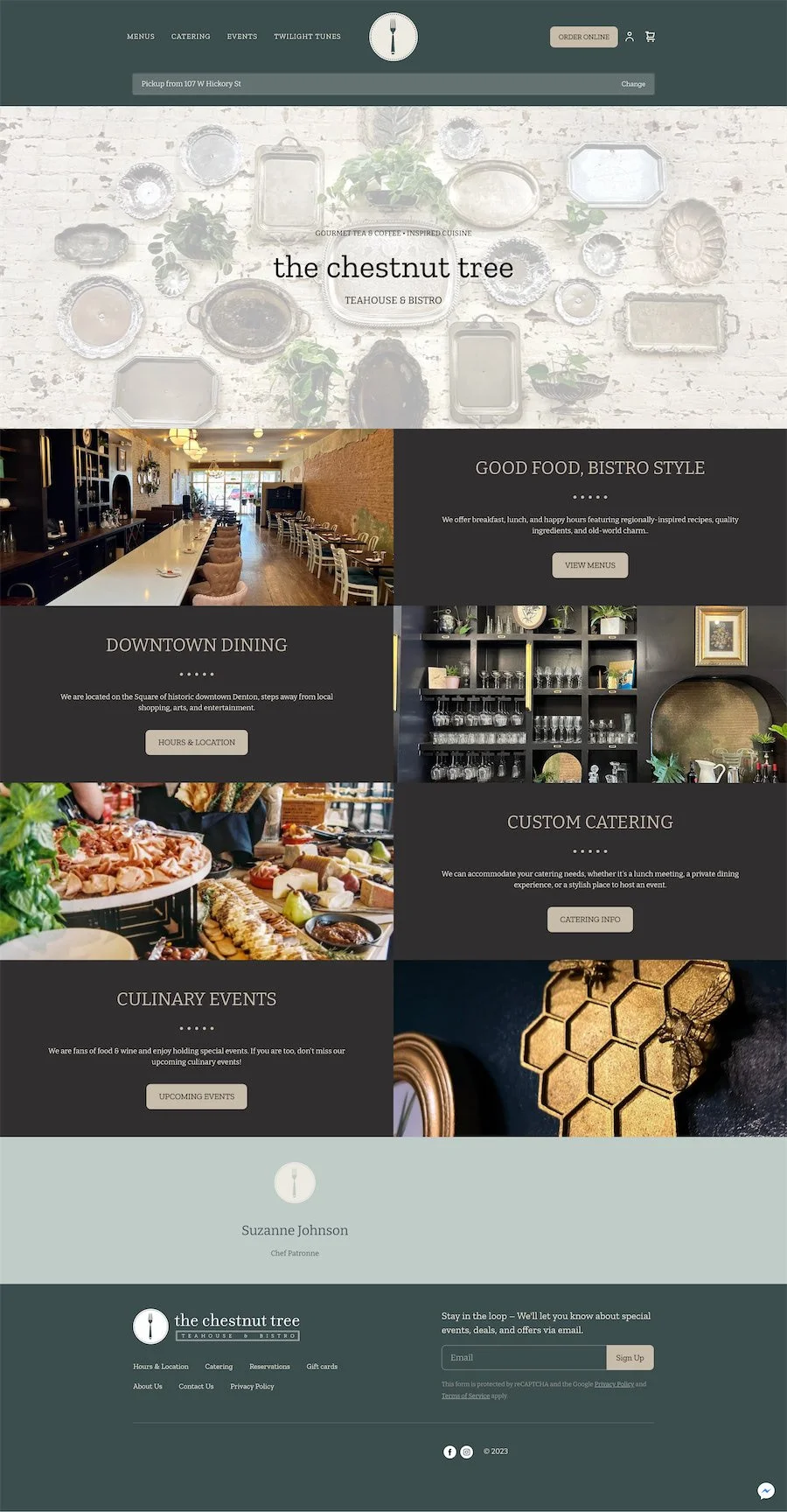
This site feels like stepping into a cozy bistro on a rainy afternoon. The photos are inviting, the menu is easy to browse, and it makes booking a table simple. You can practically taste the tea just from the way the site looks.
6. Lakes Coffee Roasters

This is a clean, modern coffee site that makes the product the star. The bags of beans are photographed beautifully and subscriptions are front and center. It is a perfect example of how Square makes eCommerce simple for small coffee brands.
Floral and Event
For floral and event businesses, visuals matter most. Square makes it easy to pair striking photography with eCommerce features like ticket sales and retail products.
7. Rowdy Poppy
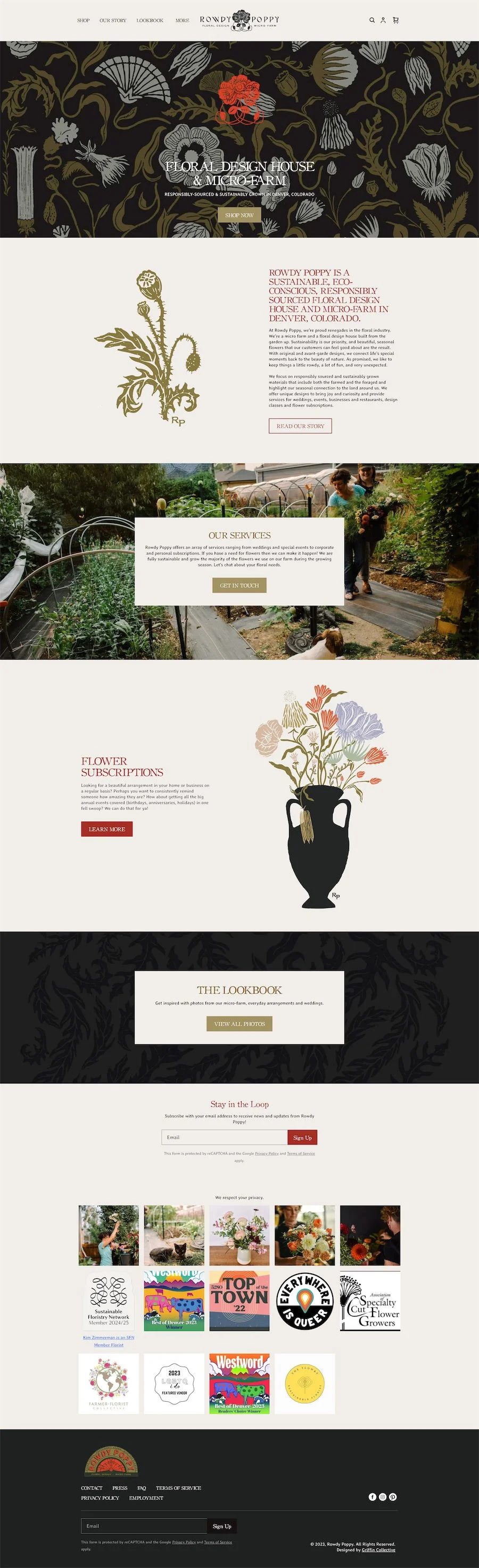
This floral design site feels like art. The arrangements are displayed in bold, unexpected ways that immediately show off the designer’s style. It is not just flowers for sale, it is creativity captured on screen.
8. Local Stems Farm

I love how this site blends retail with experiences. You can buy a bouquet or a ticket to an event on the farm, all from the same place. It shows how flexible Square can be for businesses that want to build community as well as sell products.
Retail and Makers
Retail websites succeed when they keep the focus on the products. Strong photos, clean layouts, and smooth checkout flows make it easy for customers to buy.
9. Sharla Jewelry


Whimsical and personal. The site feels like a peek into the maker’s world and it makes the handmade products feel special. It is warm, colorful, and completely on brand for a shop filled with treasures.
12. Casita Bebés - Retail & Baby Boutique Website Example
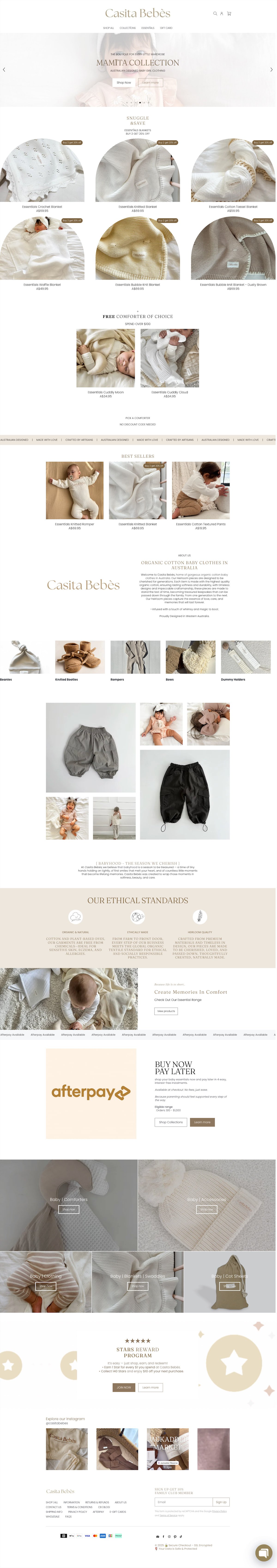
Casita Bebés is a charming Australian baby boutique that shows how clean design and thoughtful photography can make an online store feel personal. The site keeps the focus on the products with a soft, neutral color palette and easy navigation.
Each item page includes detailed descriptions, high-quality images, and clear “Quick Shop” buttons that make checkout effortless.
Quick Tip: If you’re building a shop like this, group products into clear categories (like “Toys,” “Nursery,” and “Gift Sets”) and keep your homepage minimal so the products stand out.
Barbers and Grooming
Barber and grooming sites win when they look sharp and make booking effortless. A confident design paired with a clear call to action is all it takes.
13. The King of Fades
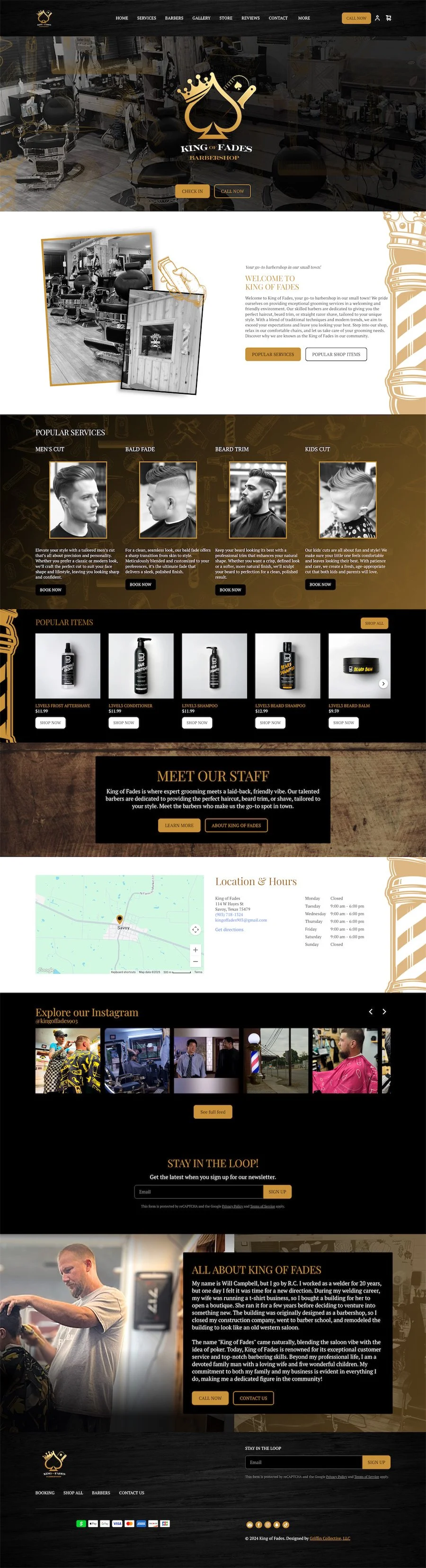
This barber site knows its audience. The colors are bold, the design is sharp, and the booking button is front and center. It gives off confidence and makes it clear that you are in good hands.
14. Early Bird Barbershop

Early Bird leans into a classic barbershop feel with clean design and easy navigation. The branding is approachable and friendly, and the booking flow is quick. It shows how a simple layout paired with strong photos can still feel professional and inviting.
Tips to build your Square Site
Choose a Template That Matches Your Industry
Pick one that’s already close to your vibe, then adjust with your branding and content.
Make Your Call to Action Unmissable
Whether it’s booking, shopping, or contacting you, make it the focus of your homepage.
Keep It Visual
Invest in strong photography. Even simple product shots or candid photos of your space go a long way.
Use SEO Basics
Add keywords in your titles, write meta descriptions, and give every image a descriptive alt tag.
And as your build your website, remember…
The best Square websites are not the ones with the most effects or the fanciest layouts. They are the ones that guide customers clearly toward the next step. Each of the examples above shows how simple design choices can create a powerful result.
If you are building your own site, focus on three things: make your booking or buy button easy to find, keep your content clear and up to date, and always check how your site looks on mobile. Small improvements in these areas can make a big difference in how many visitors turn into paying clients.
A website should not just sit pretty on the internet. It should work for your business every single day.